
Deep, Moody Accents Like Midnight Navy and Charcoal Are Grounding the Modern Open-Plan Homes of Upstate South Carolina
- Amber Griffin
- Apr 17
- 5 min read

There’s a moment many homeowners experience when standing in the middle of an open-plan kitchen. The space is bright. The ceilings are high. The light pours in from every direction. And yet… something feels unfinished.
Sure, everything is nice. Clean. Neutral. Safe. But it doesn’t quite land.
This is often when people start craving contrast. Something deeper. Something that gives the room weight and intention instead of letting it float away into beige sameness.
That’s exactly why modern home color trends Upstate South Carolina are shifting toward deep, moody accents—think midnight navy, charcoal, graphite, and forest green—especially in modern open-plan homes.
At Skytop Cabinets, we see this evolution daily. Homeowners aren’t abandoning light and airy spaces—they’re grounding them. And dark cabinetry, when used thoughtfully, does that beautifully!
Why Modern Open-Plan Homes Need Visual Anchors
Open-plan living has a lot going for it. Flow. Flexibility. Natural light. A sense of connection between the kitchen, dining, and living spaces.
But without contrast, open spaces can feel: Flat. Overexposed. Lacking hierarchy.
And that’s where darker tones step in.
In modern open-plan home color trends, deep hues act like punctuation marks. They tell your eye where to rest. They create rhythm. They give structure to a space that might otherwise feel endless.
Dark cabinetry isn’t about drama for drama’s sake. It’s about balance.
The Kitchen Island as Jewelry: Midnight Navy & Charcoal Done Right

One of the most effective—and popular—ways homeowners are embracing moody color trends is through the kitchen island. Think of it as the jewelry of the kitchen.
In a mostly neutral space, a midnight navy or charcoal island:
Grounds the room
Adds visual depth
Creates a focal point without overwhelming the design
Also, we often pair darker islands with lighter perimeter cabinets to maintain brightness while introducing contrast. This approach is showing up again and again in Upstate South Carolina interior design trends, especially in homes that value both elegance and warmth.
And when the island cabinetry is all wood? The richness goes beyond color—you can feel it!
The Emotional Impact of Dark Lower Cabinets
Color isn’t just visual—it’s emotional.
One reason moody color trends in home design are resonating so strongly right now is that they make spaces feel calm, intentional, and settled.
Using deep graphite, forest green, or charcoal on lower cabinets:
Visually anchors the kitchen
Makes the space feel more grounded and secure
Allows upper areas to remain light and open
This approach works especially well in modern open layouts, where the kitchen is visible from multiple rooms. Darker lower cabinetry keeps the space from feeling top-heavy or unfinished.
Note that it’s not about making the room darker—it’s about making it feel complete.
Dark Cabinetry + Bold Stone = A Natural Pairing
One of the most exciting aspects of this trend is how beautifully dark cabinetry pairs with stone.
We’re seeing homeowners gravitate toward:
Bold-veined marble
Dramatic quartzite slabs
Natural stone with movement and contrast
Against a charcoal or navy cabinet base, these surfaces shine. The stone becomes art. The cabinetry becomes the frame.
This pairing is a hallmark of modern home color trends in Upstate South Carolina—elevated, but not flashy. Confident, but not cold.
Why Matte Finishes Are Winning on Dark Cabinets
Glossy dark cabinets had their moment. But fingerprints had their say.
Today’s homeowners are choosing matte and low-sheen finishes for dark cabinetry—and for good reason.
Matte finishes:
Minimize fingerprints and smudges
Emphasize texture instead of shine
Feel softer and more refined
Age more gracefully over time
Plus, in high-use areas like kitchens, this matters. A matte charcoal cabinet still looks good at the end of the day—even when life gets messy.
And when paired with all-wood construction, matte finishes highlight craftsmanship rather than hiding it.
Creating Visual Rhythm with Multi-Material Design
One of our favorite ways to work with dark cabinetry is through multi-material combinations.
Instead of relying on a single color or finish, we layer:
Dark painted cabinetry
Natural wood elements
Metal hardware or accents
This creates visual rhythm. A sense that the space has movement and intention.
For example:
A charcoal island paired with warm oak shelving
Navy lower cabinets balanced by light wood uppers
Dark cabinetry offset with brushed brass or blackened steel hardware
This approach keeps modern open-plan homes from feeling flat or overly uniform.
Lighting Makes or Breaks Dark Cabinetry
Here’s an important truth: dark cabinets demand good lighting.
But that’s not a drawback—it’s an opportunity.
In Skytop kitchens, we design lighting in layers:
Under-cabinet lighting for task work
Accent lighting to soften dark surfaces
Interior cabinet lighting for both function and glow
When done right, lighting doesn’t fight dark cabinetry—it enhances it!
In fact, dark cabinets often benefit more from thoughtful lighting than light ones do. They create contrast, depth, and warmth that shift beautifully throughout the day.
Smart Storage Keeps Dark Kitchens Feeling Clean
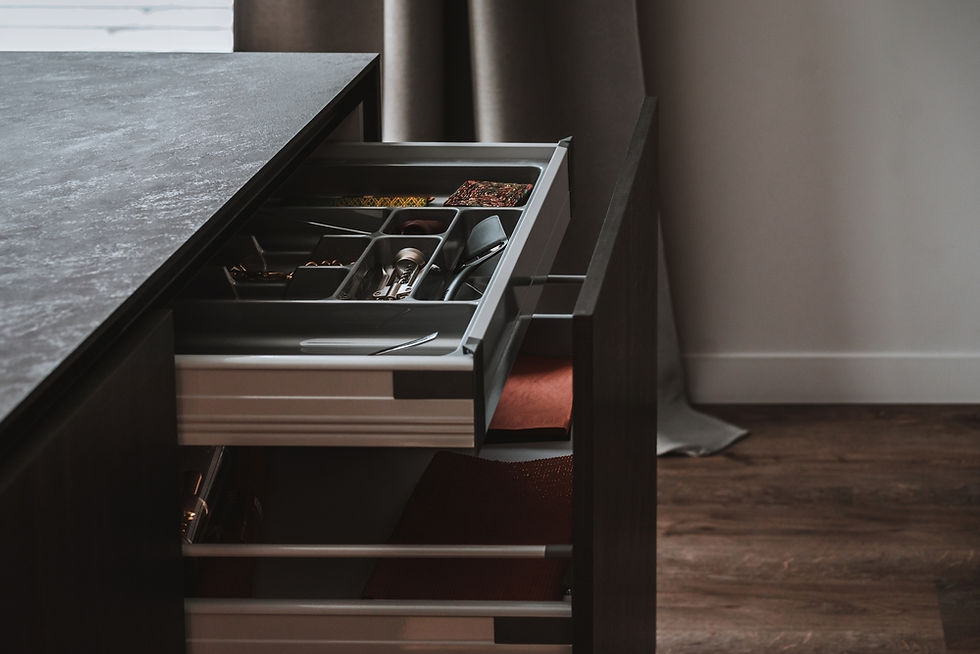
One concern homeowners sometimes raise is this: “Will dark cabinets show clutter more?”
The answer depends on the design. When dark cabinetry is paired with smart storage solutions, the space actually feels cleaner.
We incorporate:
Deep drawers instead of hard-to-reach shelves
Pull-out trash and recycling
Cutlery organizers that make sense
Charging drawers that hide cords and devices
Dark cabinets don’t show clutter—they show design. And good design hides the mess.
Yes—even that drawer that currently eats every measuring spoon you own? We can fix that!
All-Wood Construction Matters More with Dark Finishes
Dark colors are honest. And they don’t hide poor materials.
That’s why all-wood construction is non-negotiable when working with moody cabinetry.
At Skytop Cabinets:
We never use particle board
Every cabinet box is built for strength and longevity
Joinery is designed to hold up under daily use
Dark finishes highlight craftsmanship. When the structure underneath is solid, the result feels intentional—not trendy.
And in the fluctuating climate of the Carolinas, real wood simply performs better over time.
Dark Doesn’t Mean Cold—Especially in the Mountains
One misconception we often hear is that dark cabinetry feels too modern or too stark for mountain homes. In reality? The opposite is often true.
When paired with:
Warm wood tones
Natural stone
Soft lighting
Thoughtful textures
Dark cabinetry feels cozy, grounded, and deeply connected to the landscape.
It mirrors the shadows of trees, the depth of stone, and the calm of evening light—elements that are part of daily life in this region.
How Skytop Helps You Choose the Right Shade
Not every navy is right. And not every charcoal belongs in every kitchen.
That’s why our process is deeply personal.
We consider:
Natural light direction
Ceiling height and room volume
Surrounding finishes
How you use the space daily
Our goal isn’t to follow a trend—it’s to help you choose a color that still feels right years from now.
Now, that’s the difference between “on trend” and well-designed.
The Skytop Difference
We’re not a franchise. We’re not a catalog showroom.
We’re a local team that designs, sources, and installs what we recommend.
That means:
✔️ Thoughtful guidance instead of pressure
✔️ All-wood cabinetry without shortcuts
✔️ Precision installation
✔️ Ongoing aftercare
We don’t just design kitchens—we design spaces that feel good to live in.
Ready to Explore Darker, Richer Design?
If you’re drawn to deeper tones but unsure how to use them, you’re not alone—and you don’t have to figure it out alone.
We’ll bring the ideas, craftsmanship, and neighborly care—so your home doesn’t just follow trends… It feels like it finally found its footing.


